Money Design.
This was a school assignment, given by our teacher Simon Halskov Nielsen from Markant advertising agency.
The assignment was to design a new series of Danish banknotes.
It was not allowed to have famous or semi-famous people on the banknotes and no antiquities, as it is seen many times before.
About.
School assignment
Design, Art direction, Illustration.
2016 / 2. semester
CLIENT
SERVICES
YEAR

It' all about the money.
It was not allowed to have famous or semi-famous people on the banknotes and no antiquities, as it is seen many times before.
We had to design and argue our choice of colours, typography, illustrations, National Director's signature, amount, front and back.
There were a number of security design we also have to think through as a watermark, micro-printing, hologram, security thread, serial number, uv, patterns, Guilloche pattern and copper engravings.
The series should consist 50 DKK, 100 DKK, 200 DKK, 500 DKK and 1000 DKK notes.
This assignment I made with my classmate Mie Pilborg Johansen.


Inspiration.
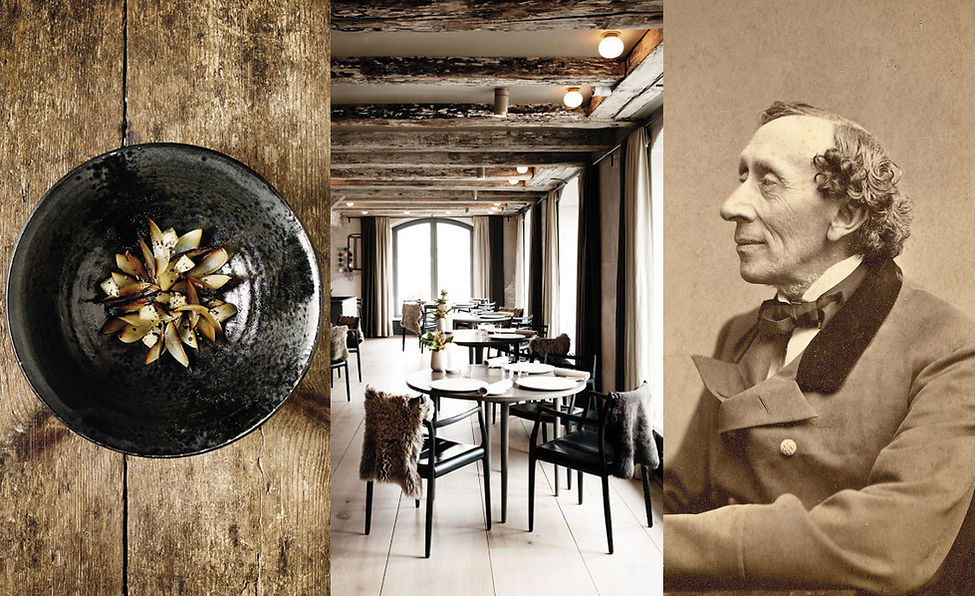
Our inspiration stems primarily from what we associate with Denmark; characteristic writers, new Nordic, the Skagen painters, the traditional Danish wedding, etc.

Concept moodboard.
Our final choice to the concept of the banknotes should be the mix between the Hans Christian Andersen's old fairy tale and the new Nordic cuisine, which has become a prevalent concept in Denmark and the Nordic countries, not least because of the restaurant NOMA. We wanted to create a story-telling - yet contemporary - design.
Sizes and colors.
We chose to reuse the colors that are on the current banknotes. In this way, notes a more realistic and recognizable design.

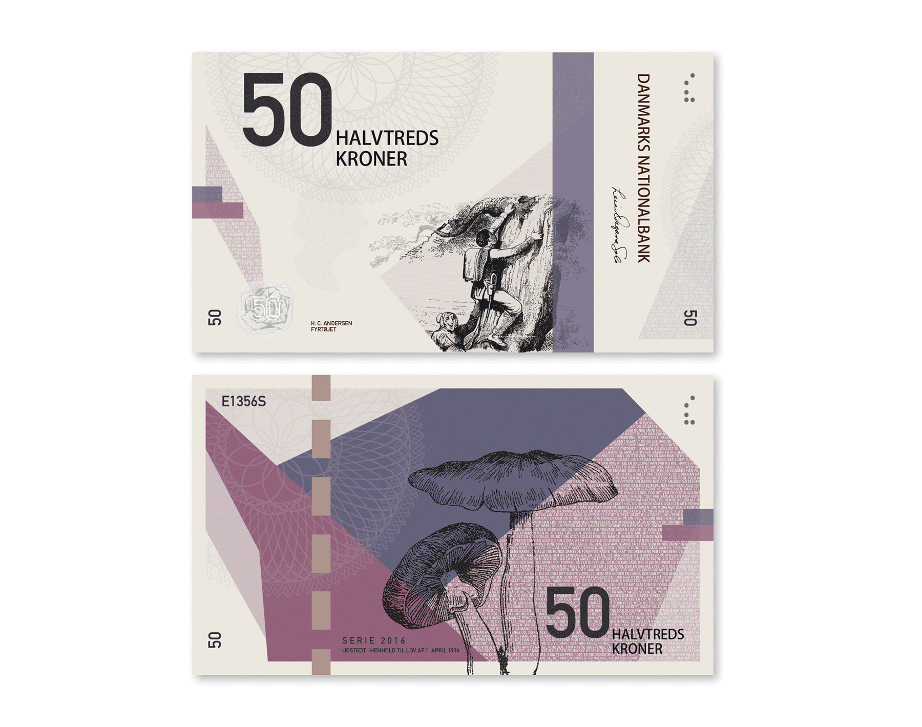
Illustrations front.
The illustrations are from 1992 designed by Vilhelm Pedersen and Lorenz Frolich. The drawings provide just the fairytale feeling we wanted to emphasize on the banknotes.

Illustrations back.
To the back, we have used ingredients from the Nordic kitchen.
The idea is that each element should match the fairy tale on the front.
We combined the tinder-box with mushrooms, because the soldier climbs up a tree in the forest.
In Clumsy Hans he comes across a cornfield and in the fairy tale of the Ugly Duckling the story takes place in a lake, therefore the fish.
Princess and the Pea is combined with berries, because a princess in the fairytale significance, is often beautiful and has reddish clothes. Finally, nettle combined with Thumbelina due to the consistency of the green element; waterlily and stinging nettle.

UV security.
For UV printing, we have used the same illustrations as on the back. There are for example mushrooms on 50 DKK bank note and 100 DKK has grain. We have chosen to use a pattern that fills the bank note, in this way it is more difficult to copy.

Watermark security.
To provide additional security, we have used different silhouettes of Hans Christian Andersen on the banknote. The greater the value of the banknote, the older, Hans Christian Andersen appears in the watermark.

Hologram security.
Inside the holograms are different Nordic ingredients that matches the ingredient, which is printed on the back. In this way, the Nordic element is more visible on the note. To increase safety we have also placed a pattern at the back..